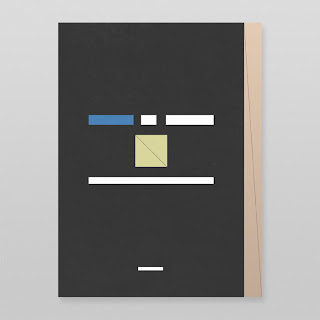
Hyperkit is a small, London studio formed in 2001 that produce "good-natured, useful design, often bringing together a love of material, process and functionality". I really liked their clean-cut, contemporary editorial design, allowing little details, stocks, finishes or processes to become the focus. They also did a great branding job on a deli/restaurant which was based on a lovely family of illustrations that were applied throughout numerous applications.
Sunday, 30 October 2011
Stephen Di Donato
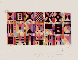
Lovely solar system poster series designed by Canadian Stephen Di Donato. The imagery has a contemporary cubist feel to it combined with an excellent application. The Jupiter and Neptune posters are my particular favourites. The designs have also been developed into smart phone wallpapers.
Labels:
Colour,
Design for Digital,
Illustration,
Information Graphics,
OUGD301,
Posters
Saturday, 29 October 2011
Jan Avendano
Some stunning colour and pattern based work here by illustration based designer Jan Avendano. The experimental book covers below are taken from his personal collection of books where he has then replaced images with diagonal lines and text with blocks of colour - unusual concept which has a great effect, particularly in a large collection such as this. I really admire his application of colour, my favourite example being the '1985' numbers.

Labels:
Colour,
Design for Print,
Editorial,
Illustration,
Layout,
OUGD301,
Paper Crafting,
Pattern,
Typography
Vanessa Lam
Vanessa Lam is an American designer who focusses on branding, print and packaging. I picked up on her after seeing her branding work for Chicago's Museum of Science and Industry as I thought it could help inform my resolutions for my Colour Exhibition project. It includes an extensive application of the brand over a wide range of supporting collateral and is a great example of how keeping the initial logo/identity simple and then building it up across a range of media helps make it something much more comprehensive.
Subscribe to:
Comments (Atom)


