I'm not really into my web design, but I can still appreciate a great site. And this is definitely one - developed by Argentinian design and direction studio Mind the Grid for a local 'pasteleria' (pastry shop) Las Donias. The Hi-Res photography is stunning and it does the exactly the job it is meant to in that it makes you want to eat everything that you see. The layout is clean and contemporary allowing the main focus to be on the wonderfully colourful cakes and pastries. I think particularly when it comes to designing work for screen, the more image and less text the better. If the photographs are good enough then there shouldn't be much more you need to say.
Tuesday, 28 June 2011
Saturday, 25 June 2011
COOEE
COOEE aka Leon Dijkstra provides a direct collaboration between client and designer. Specialises in editorial design and visual identities for small and large clients in a diverse range of fields.
The aim is creating a coherent, authentic and distinctive design solution that communicates and is driven by its content, strategy and exploration.
Labels:
Colour,
Design for Print,
Layout,
Publication,
Studios
Friday, 17 June 2011
Stockholm Design Lab
Couple of projects here from the renowned Stockholm Design Lab. Beautiful architectural project for the modern museum in Malmo where they have been involved in both the interior and exterior design. Typically Scandinavian in style - contemporary, clean, simple with bold blocks of colour - it all works together perfectly. The orange exterior really complements some of the tones in the older buildings that it sits next to.
Labels:
Architecture,
Colour,
Exhibition,
Identity,
Interior,
Retail,
Typography
Sunday, 12 June 2011
Maddison Graphic
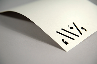
Brilliant little stationery set by Maddison Graphic created for a writer and journalist. The large glyphs enclosed in apostrophes make a bold little logo, especially when applied in gloss black set on a range of vivid colours. Great example of how you don't have to use a limited colour scheme to keep a range of products together - here, the layout and arrangement give the design consistency.
Labels:
Branding,
Business Cards,
Colour,
Design for Print,
Identity,
Layout,
Logo,
Stationery,
Stocks and Finishes
Saturday, 11 June 2011
Negro
After seeing Negro's typefaces in IdN, it led me to their website where I found some fantastic publications. They have a cool and contemporary feel, achieved often through just using black and one other colour which gives each piece a pleasing simplicity that allows the typography, imagery and layout to be the focus.
Labels:
Colour,
Design for Print,
Editorial,
Layout,
Publication,
Stocks and Finishes
Subscribe to:
Posts (Atom)


