Monday 23 November 2009

Martina Flor


I have picked out this piece of typography by Argentine designer Martina Flor because of how she has turned a simple bit of type into something eye catching through clever colour work. Using the complimentary colours of sky blue and a cherry red makes the text 'pop' out of the page whilst the white layer helps to neutralise this meaning it remains comfortable for the viewer to read.

Tania Alvarez


This 'Overseas' typeface by designer Tania Alvarez I think is very attractive and engaging to look at because of its free flowing form and the colour palette is made up of my favourite colours- grey, black, white and blue. It reminds me of sea anenomes drifting in the ocean and communicates a very peaceful and serene tone.

Christian Montenegro


Argentine illustrator Christian Montenegro is one of my favourite designers. His beautifully hand painted and screen printed illustrations I find very playful and endearing, examples of which pictured above are called 'Imaginary Beings'. I think his style is almost a contemporary take on Picasso with a vivid but carefully considered application of colour which helps communicate the messages within his work.

Saturday 21 November 2009

Sweden Graphics


Above are a selection of t-shirts by a company called Sweden Graphics. I chose these because I felt they clearly communicated a message simply and effectively through contemporary, bold images. The environmental theme is conveyed through a series of six t-shirts with symbolised motifs printed in bold colours that communicate instantly because of their high impact design.


Paul Bradley


I chose this work by Paul Bradley as I feel it presents aspects such as culture and identity in an attractive, original manner. I like the way that he has merged different tones and shades of watercolour and then picked out areas of finer detail. I feel that the different faces represent race or religion for example and I also like the way he has presented his work in the third photo where each face is found at the end of a branch all coming from the same tree trunk.


Antoine & Manuel

This wall mural by Antoine and Manuel was designed for the Colette Shop in Paris. I chose it because of its ability to construct meaning from visual images and type. I really like the mix of organic and mechanical forms that take on a sleek, modern form and work really well in the restricted colours of black and grey on a white background.


Supernature


I selected these digital barogue patterns as an example of interpreting images from a range of cultures. I really like the way the traditional pattern work has been fused together with a contemporary colourscheme of silver and grey to give a stylish finish.


Martin Woodtli


I picked out these pieces of work by Martin Woodtli because they communicate a meaning through type. They were created for the museum of design in Zurich and suggest that design is produced through playing and experimenting. I particularly like the funky domino typeface.


Friday 20 November 2009

Nike


Deprived Anxiety


I like this typeface by Deprived Anxiety because of its bold and chunky form and it works well in the black to light grey gradient in the top photo.

Tom Tor Studio


These environmental posters created by US designers Tom Tor Studio has to be one of my favourite posts yet. Through beautifully designed contemporary illustration and appropriate colour work I think they have created a really visually engaging series that effectively communicates their 'green' message. The composition and colours mean they work well either alone or as part of a series and with a small amount of accompanying text they manage to successfully promote their campaign about 'greenday'.


Matt Lyon


I find the playful illustrations of Matt Lyon very engaging to look at because of his excellent compositions and application of colour. All of the intersecting lines create a jumbled effect which is a trademark of his work and I think it makes each piece quite ambiguous leading the viewer to take almost whatever meaning they want out of the designs.


Martina Flor


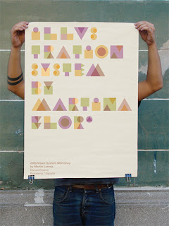
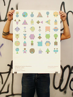
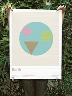
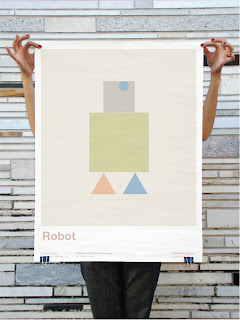
These pieces of illustrative type show a very different side of Martina Flor's work where she has constructed a beautiful typeface and a set of symbols out of overlaid geometric shapes. The careful layering and position of each shape leads to the typeface maintaining its ledgibility and the symbols still communicating instantly. The superbly chosen range of subtle colours that make up the palette work brilliantly together and are used really well in order to attract and deflect attention to and from different parts of the letterforms and symbols so that they still communicate successfully.

Martina Flor


This is the first of two pieces I have selected by Argentine designer Martina Flor and shows how she translates her unique style into the corporate world. I really like the way she has combined both manual and mechanical techniques such as the hand illustrated horses, screen printed stars and embossed typography to create what I think is a quaint, individual take on the established Levi's brand.

Christian Montenegro


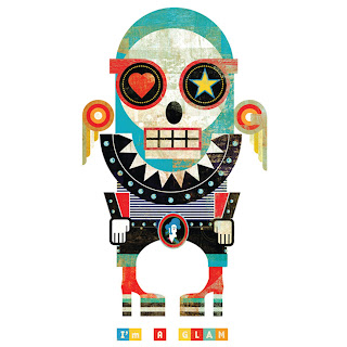
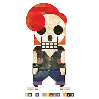
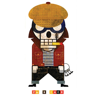
I really love these unique characters created by illustrator Christian Montenegro. I was really impressed with how he has taken recognised stereotypes and transformed them by applying his very distinguishable style. Each character doesn't even need the sentence below it as the images communicate instantly and effectively alone. Also the colour palette used and applied through screen printing and hand painting is highly successful and obviously integral to the imagery.