Awesome range of packaging and application across the board for focacceria Buenas Migas, by spanish studio Mucho. I love the organic print look to the type and image which conveys a commercial style that has real personality behind it. I particularly like the labels on the drinks bottles.
Saturday, 21 May 2011
Mucho
Labels:
Branding,
Colour,
Design for Print,
Identity,
OUGD203,
Packaging,
Products/Outcomes,
Subject/Content
Wallzo
A rather nice stationery set for McCormack Joinery, design by Wallzo and printed by Generation Press.
HORT - Calle Newsprint
Beautifully considered piece of print by HORT for street football brand Calle. I really like the balance between type and image and also how the colours seem to amplify as each fold is revealed. Just my kind of thing..
Labels:
Colour,
Design for Print,
Layout,
OUGD203,
Posters,
Products/Outcomes,
Promotional
Process Journal: Edition 4
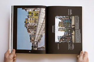
Not sure exactly who designed this Process Journal but I picked it out because it appears to be a really tightly produced publication with a focus on typography and specialist finishes. The bold type works really well on the cover which has then been overlaid with foiling and de-bossing which creates a modern and luxurious feel.
Proud x ICON - Rethink Rhyl
Colourful new identity created by Proud for the British seaside resort of Rhyl. Each one of the posters promotes an attraction within the town and the new brand is held together by the patternwork formed from geometric shapes. I particularly like the two top posters which to me suggest the sand and the sea but in a modern, non-cliché manner.
Labels:
Branding,
Colour,
Identity,
OUGD203,
Posters,
Products/Outcomes,
Subject/Content
Build
Great range of packaging and promotional products for T&Cake made by Build. The simplicity is key to its success with minimal splashes of colour to the white products and a clean and modern type based logo.
Labels:
Branding,
Design for Print,
OUGD203,
Packaging,
Products/Outcomes,
Promotional
Cornwell
Promotional pieces to flag the launch of a new website for Hecker Guthrie produced by Cornwell. I think the muted colours are a big success and the chunky typeface works so well, particularly on the business cards.
Labels:
Branding,
Business Cards,
Colour,
OUGD203,
Products/Outcomes,
Promotional,
Stationery
Tayburn
Beautifully packaged promotional/informational piece created for Edinburgh printers by Tayburn. It has a really nice authentic feel but everything is presented in a clean and contemporary manner. I think the photography, colourscheme and layout works very well.
Labels:
Colour,
Design for Print,
OUGD203,
Packaging,
Products/Outcomes,
Promotional
Friday, 20 May 2011
Triboro design
Brilliantly simple take on the New York subway map by Triboro, all printed in one colour neon red. The modern style of the map manages to retain an easily readable format where the included information is clearly legible making the piece highly functional as well as aesthetically pleasing.
Non Format
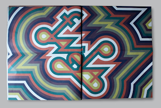
Front & back cover design for the 50th issue of the Japanese design magazine +81. Beautifully constructed from bold and bright abstract shapes and the minimal typography on the diagonal works really well as it follows the edge of the shapes.
Labels:
Colour,
Design for Print,
Editorial,
Functions/Purposes,
Layout,
OUGD203,
Publication,
Subject/Content
Subscribe to:
Posts (Atom)


