Ok so I did a post on
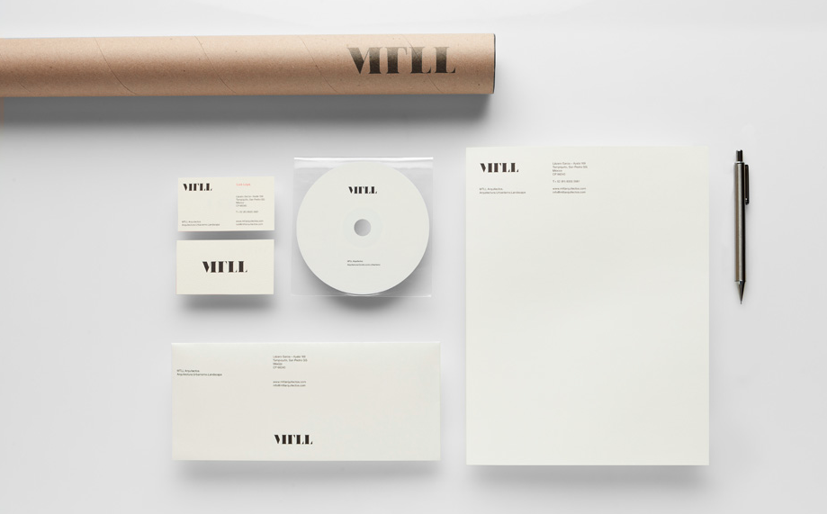
Anagrama back in June and since then have taken keen interest in their work. Now, a couple of lovely new projects means they have earned a second update on my blog. The first one is a classy visual identity for a young architects firm led by a striking logotype featuring the initials of the clients. The logotype is bold, dynamic and refined and the overall identity communicates pure quality and reassurance when combined with the off-white and black colour-scheme with hints of red. The versatility of the logo is clear to see as it is effective and legible across the stationery set including the folder and cardboard tube whilst it also looks great as a stamp.


The next project appears to be quite an unusual brief - for a latin american film studio that specialises in horror movies called Nemesis. Here, Anagrama have developed a beautiful and contemporary typographic monogram based on ancient runes that takes its place within a stunning black and white stationery set. The monogram works perfectly as the design for the stamp used with black sealing wax, which imprinted on the black stock with a slight eerie sheen comes together to convey a feel that is exactly relevant to the client. Careful attention to detail appropriate use of de-bossing helps build the air of quality whilst the wooden stake and silver bullets used in the photography are genius touches.