Some interesting and creative type work here by recent graduate Luke Robertson from Brisbane, Australia. Particularly like the bold red monotone work based on the recent occupy movement and the following poster series about the modern problems facing the Aboriginal people.
Friday, 25 November 2011
Wednesday, 23 November 2011
Dina Silanteva
Typographic music project by recent graduate Dina Silanteva based on an investigation into generative systems and modular typefaces. It's a lovely experimental approach that's resulted in a bold and energising typeface.
The Click Design
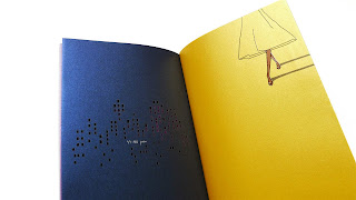
Great little typography project here by the click design who have produced small but perfectly formed book on the hand carved letterforms in and around a local church.
Labels:
Design for Print,
Editorial,
Layout,
Monochrome,
OUGD301,
Publication,
Typography
Monday, 21 November 2011
Danish Christmas Stamps
Beautiful set of festive Danish stamps from the 1960's which I saw over on present and correct. Clean, simple, Scandinavian illustration in a lovely colour palette which still looks contemporary today. Love that it takes the form of a map too, very neat.
See larger thumbnails on the website.
Labels:
Colour,
Design for Print,
Illustration,
Layout,
OUGD301,
Promotional,
Stocks and Finishes
Thomas Manss
Luxurious print publication here by Thomas Manss completed to promote Fabiano paper stocks. Nice idea to theme it around a cocktail of colours and stocks whilst showing what can be done with them in an unconventional way.
Thursday, 17 November 2011
Kaerajaan Restaurant Branding : Loovvool
Nice little identity here for an Estonian restaurant by Loovvool. Great application across a wide range of resolutions and some lovely little details give a feel of real quality.
Subscribe to:
Comments (Atom)


