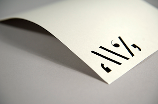
Brilliant little stationery set by Maddison Graphic created for a writer and journalist. The large glyphs enclosed in apostrophes make a bold little logo, especially when applied in gloss black set on a range of vivid colours. Great example of how you don't have to use a limited colour scheme to keep a range of products together - here, the layout and arrangement give the design consistency.


No comments:
Post a Comment