HEYDAYS is a beautiful Norwegian graphic design studio based in Oslo that specialises in printed media and creative/art direction. They clearly show classic, contemporary Scandinavian design traits often including bold type with simple shapes and colour palettes and everything is presented immaculately. I particularly like their self branding project and also that for Berg & Berg apparel but their whole portfolio showcases work that is so carefully considered and produced to such high quality with careful attention to detail. I also really love the design of their website.
Showing posts with label Web. Show all posts
Saturday, 30 July 2011
Tuesday, 28 June 2011
Las Donias Pasteleria
I'm not really into my web design, but I can still appreciate a great site. And this is definitely one - developed by Argentinian design and direction studio Mind the Grid for a local 'pasteleria' (pastry shop) Las Donias. The Hi-Res photography is stunning and it does the exactly the job it is meant to in that it makes you want to eat everything that you see. The layout is clean and contemporary allowing the main focus to be on the wonderfully colourful cakes and pastries. I think particularly when it comes to designing work for screen, the more image and less text the better. If the photographs are good enough then there shouldn't be much more you need to say.
Labels:
Branding,
Design for Digital,
Identity,
Photography,
Web
Saturday, 11 June 2011
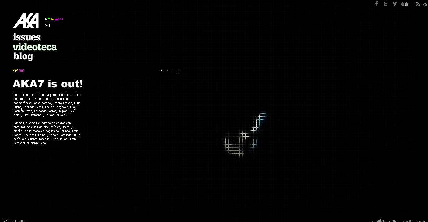
AKA Magazine
AKA is a visual art magazine based in Montevideo, Uruguay that also works through video and a blog. The website showcases a different video in the background each time you enter it and the unique manner in which it's put together makes it incredibly effective. The publication itself features mainly contemporary photography and beautiful double-page spreads.
Website:
Magazine:
Blog:
Labels:
Design for Digital,
Design for Print,
Editorial,
Moving Image,
Publication,
Web
Thursday, 10 March 2011
Fedrigoni website Vs GF Smith
The current Fedrigoni website is so dark and formal. If you were to take away the few images are there you could think that it was a webpage for a lawyer or funeral director. One of it's competitors - GF Smith - is much more on top of what they need to communicate to new and existing customers. Vivid inks and high resolution images of the stocks the company offers create a feeling of being able to touch the paper through the screen.
As part of the ycn brief, we want to address the Fedrigoni website and create a 'paper webpage' which would take the form of an actual 3D installation which would then be photographed and proposed to be used as the image for a live website. We feel that if you aren't able to have the paper in your hand at that moment - you need the next best thing - a paper webpage. In a way we are aiming to straddle the boundary between Fedrigoni's physical paper and their online web presence.
Subscribe to:
Posts (Atom)