Hungarian designer Kiss Miklos focusses on contemporary brand identity which is often type led. Black and white is also a regular feature of his work which is supplemented by different stocks or an accent colour. The simplicity of his stylised custom lettering and typography, usually black on white and executed to a high level gives a real feel of quality and elegance.
Friday, 28 October 2011
Kiss Miklos
Labels:
Branding,
Design for Print,
Identity,
Monochrome,
OUGD301,
Packaging,
Promotional,
Stationery,
Studios,
Typography
Paperlux
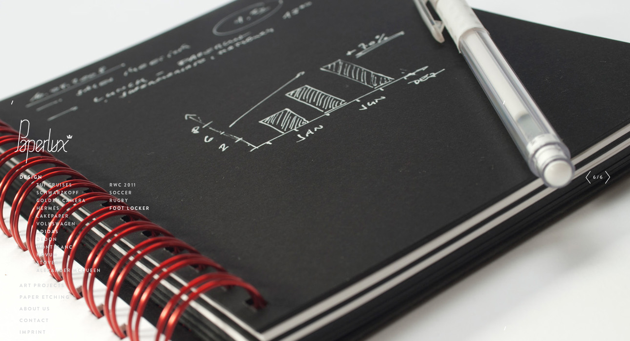
Some amazing, inventive work here by German studio Paperlux. As the name suggests, their practice is centred around paper and is combined with specialist processes and finishes. One of their most recent projects was to design covers for the 'novum' graphic design magazine which has led to some spectacular results. A vibrant triangular pattern which has initially hidden structural qualities allowing it to be folded and moulded into different shapes is something I've never seen done with a magazine cover before. Elsewhere in their portfolio, the attention to detail through etching, folding, cut outs, embossing and foiling to name but a few processes are all things which really interest me as the quality of finish is something that is of utmost importance to me.
Australasia Restaurant Branding
A beautiful brand developed here for the restaurant Australasia by Creative Lynx. I really like the mixed media and different finishes applied through the resolutions which paired with the clean typography and pale colour palette create a modern, authentic identity.
Labels:
Branding,
Design for Print,
Identity,
Information Graphics,
Interior,
Layout,
OUGD301,
Packaging,
Promotional,
Retail,
Stationery,
Typography
Thursday, 27 October 2011
Andre Gottschalk
Berlin based illustrator and graphic designer Andre Gottschalk. He caught my eye through his bold, geometric cover designs for his SEE BEFORE READING project. Behind the striking patterns, colours and shapes is a deeper concept relating to the content of each book as described in the following statement:
-
SEE BEFORE READING is a visual character system used for the generative design of book titles. This forward-looking concept works as an intuitive system for interested readers of novels. SEE BEFORE READING provides an opportunity to choose the right novel by using visual codes and makes one novel comparable to another without reading any texts. It translates content into pictures. The character representing a novel is composed of three different levels. The first level indicates the genre, the second level reflects the atmosphere of the novel and the third level provides information about the narrative structure. In this manner, different novels are made comparable on the book cover, thus assisting the readers in their choice without having knowledge of the contents and character of the book. // together with Susanne Stahl
-
Labels:
Colour,
Design for Print,
Editorial,
Identity,
Illustration,
Information Graphics,
Layout,
Logo,
OUGD301,
Pattern,
Posters,
Promotional,
Publication,
Typography
Subscribe to:
Posts (Atom)