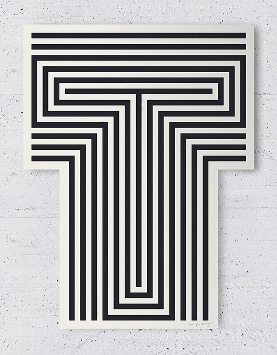
More lovely work by Toko. Awesome print-based stuff this time through some really inventive posters and editorial. It has a really nice and fresh feel to the work whilst you can tell they really try to approach individually and not apply a certain style to every project.
Sunday, 16 October 2011
Toko
Labels:
Colour,
Design for Print,
Editorial,
OUGD301,
Posters,
Promotional,
Publication,
Typography
Friday, 14 October 2011
Toko
Found some great exhibition based graphic design from Toko that I thought would be really relevant to my work on promoting a colour exhibition. I particularly like the black and gold theme which incorporates some absorbing geometric patterns that work brilliantly when applied across a range of resolutions. They really tie the whole concept together and create a luxurious and contemporary feel.
Labels:
Branding,
Colour,
Exhibition,
Identity,
Installation,
Interior,
Monochrome,
OUGD301,
Posters,
Promotional
Thursday, 13 October 2011
Saturday, 8 October 2011
Cleverfranke
Cleverfranke is a dutch design studio that works across both print and screen based resolutions, often with a focus on information graphics and data visualisation. I really admire the balance they carefully seem to strike between type, colour, shape and format which means the resolutions are often clear and east to absorb.
All About Tea / Moving Brands
Meant to do a post about this a while back but somehow forgot... although I got a reminder after seeing it on the 'fontsinuse' website today. It's a lovely, sophisticated, monochrome identity developed by Moving Brands for wholesale tea company - All About Tea. With the Orator typeface being one of my all time favourites it's easy to see why I like this brand as it features prominently across it. I think the logo is hugely successful as it clearly and simply communicates the tea leaves inside the bag as well as the straining process. The identity has been kept functional yet upmarket as it has been applied across a range of products with the die cut logo on the business card being one of the best touches.
Labels:
Branding,
Business Cards,
Design for Print,
Identity,
Logo,
Monochrome,
OUGD301,
Packaging,
Photography,
Stationery,
Typography
Tuesday, 4 October 2011
Progress Tutorial, Brief Amendments & Confirmation
Brief 1/ Colour Exhibition:
Identity, Promotion, Posters, Tickets, Invitations, Event Guide - Editorial.
Brief 2/ Pancake House Men's Fashion Store:
Identity, Concept, Theme, Brand, Application across a range.
*After discussion with Amber and fellow students during the tutorial it became more obvious that the brief to brand the pancake house brief was going to end in resolutions that would be too similar to the collaborative restaurant branding brief. Therefore I have swapped it for one of my other brand identity briefs from the 10 I collected over summer, to one based on a Men's clothing/fashion store. The updated version of this brief is shown at the bottom of this post. Perhaps some of my ideas initially generated will be possible to carry over into the restaurant branding once that briefs begins later in the module.
Brief 3/ Restaurant Branding (Collaboration)
Concept Restaurant, Identity, Interior/Exterior, Menus, Packaging.
Brief 4/ ISTD
'Putting on a fresh face'
------------------------------------------------------------------------------------
PRINT BASED IDENTITY
------------------------------------------------------------------------------------
Men's fashion store brief that replaces the pancake house brief.
Subscribe to:
Posts (Atom)